Here at WhatCounts, we take our customer feedback seriously — and when it comes to our technology, we hear you loud and clear. That’s why, in this upcoming release, you’ll be seeing an update to our platform’s dashboard that’ll provide a better user experience. Here’s what you can expect:
1. Simpler Design
Charts and graphs can be very pretty and great to look at, but if they don’t provide you the information you need to know at a glance, then we need to find a way to be more effective. That’s why we simplified the design. Now, when you sign in, all the colorful displays and images will be gone:

And are being replaced by a simpler, sleeker, and more informative dashboard:

2. At A Glance
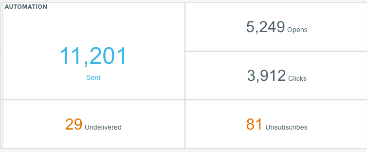
You’ll notice that we removed Timeline and Path Analysis from the dashboard. Now, instead of only seeing information pertaining to campaigns you’ve sent out in the last 7 days, you’ll see reporting about how your marketing campaigns AND automations are performing:


3. Quick Launch
To help cut down on your navigation time, we’ve also implemented a quick link feature that’ll display at the top of your dashboard:

The links that populate this area will be your most frequently visited sections of the platform. No more clicking through the sidebar to get to the areas you use the most. Just log in and you’ll be set up to dig right in.
We Want To Hear From You
Like we mentioned, we take our clients’ feedback very seriously. If you have any questions, concerns, or ideas you’d like to see implemented feel free to contact Support or reach out to your CSM and let them know.


